
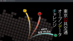
「東京公共交通オープンデータチャレンジ」結果発表
“Tokyo Public Transport Open Data Challenge” Result Presentation
https://tokyochallenge.odpt.org/award/index.html
世界一複雑とも言われる公共交通網を持つ東京においては、2020年にオリンピック・パラリンピックの開催を控え、公共交通データのオープンデータ化は、国内外からの期待を集めています。
公共交通オープンデータ協議会は、公共交通データのオープンな流通のために、
東京に関係する主たる公共交通事業者およびICT事業者とともに立ち上げた産官学連携の協議会です。現在、合計56の組織が参画しています。
との前振りで初めたようです。
その結果発表が結構面白い。
In Tokyo with public transportation network which is said to be the most complex in the world,
Ahead of the Olympic and Paralympic Games in 2020,
Open data of public transport data, has attracted the expectations from home and abroad.
Public transport open data Council, for the open distribution of public transport data,
Is the Council of industry-government-academia collaboration was launched along with the main public transport operators and ICT companies involved in Tokyo. Today, a total of 56 organizations are participating.
It seems that it started early with.
The result is fairly interesting as a result.
「東京公共交通オープンデータチャレンジ」タグアーカイブ
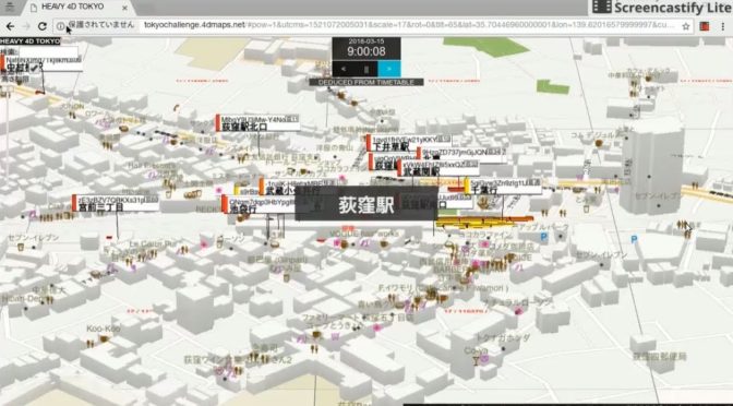
首都圏の鉄道・バスの“動き”4次元地図がA列車みたいだ
首都圏の鉄道・バスの“動き”を丸ごと可視化した4次元地図
首都圏の公共交通機関のアイデアを募集するコンテスト「東京公共交通オープンデータチャレンジ」
A 4-dimensional map that visualizes the “movement” of railroads and buses in the metropolitan area
Contest “Tokyo Public Transport Open Data Challenge” to recruit ideas for public transportation in the metropolitan area
これ
this
オギクボ開発株式会社が開発だと
鉄道については、中央線はオレンジ、総武線は黄色と、色で路線が分かるようになっており、箱の数で編成の編成両数を表現
それぞれの列車には、行き先や「普通」「通勤特別快速」といった列車種別の情報も動きに追従して表示される。
バスは会社ごとに赤色または青色、緑色などの色で描かれており、「荻12」などの系統と「武蔵関駅」「東京医大病院前」など行き先の情報が表示
なんてクオリティだろう
A列車でいこうのリアル版みたい!
For railway, the central line is orange,
Sobu line is yellow,
Are adapted to route is seen in color, representing the number organization both of the organization by the number of boxes
Each of the train, information of the train type, such as destination and “normal”, “commuter special fast” is also displayed so as to follow the movement.
The bus is drawn in red, blue, green, etc. colors for each company,
“Ogi 12” and other lines and “Musashi Seki Station” “Before Tokyo Medical University Hospital” etc.
Destination information is displayed
What quality it is
It looks like a real version of A train!
「HEAVY 4D TOKYO」
http://tokyochallenge.4dmaps.net/